Riebeek Cellars
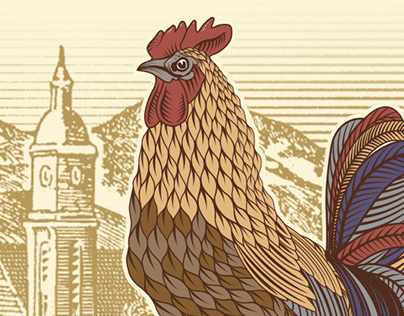
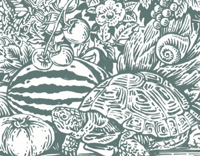
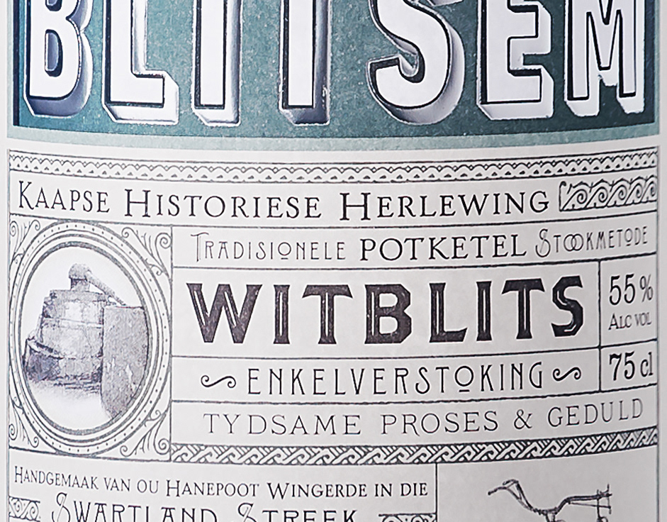
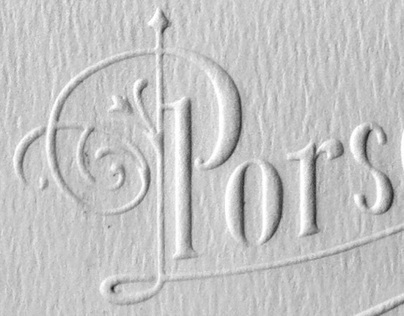
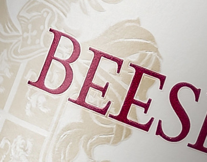
Swartland being the main focus, Riebeek Kasteel town and mountain was made to be the stars of the new Riebeek Cellars labels. The typography was then brought in to be more suited to the illustration. An old etch illustration style is paired with bright colours to draw attention on the shelf whilst also retaining the sense of gravitas. In the back, a ship sailing past Table Mountain emphasises the name Riebeek's origins. The new labels do away with black backgrounds and high glossy finish, to be more earthy and draw more attention on a shelf environment.
